Reimagining Fonio Packaging with Purpose
Yolélé
Overview
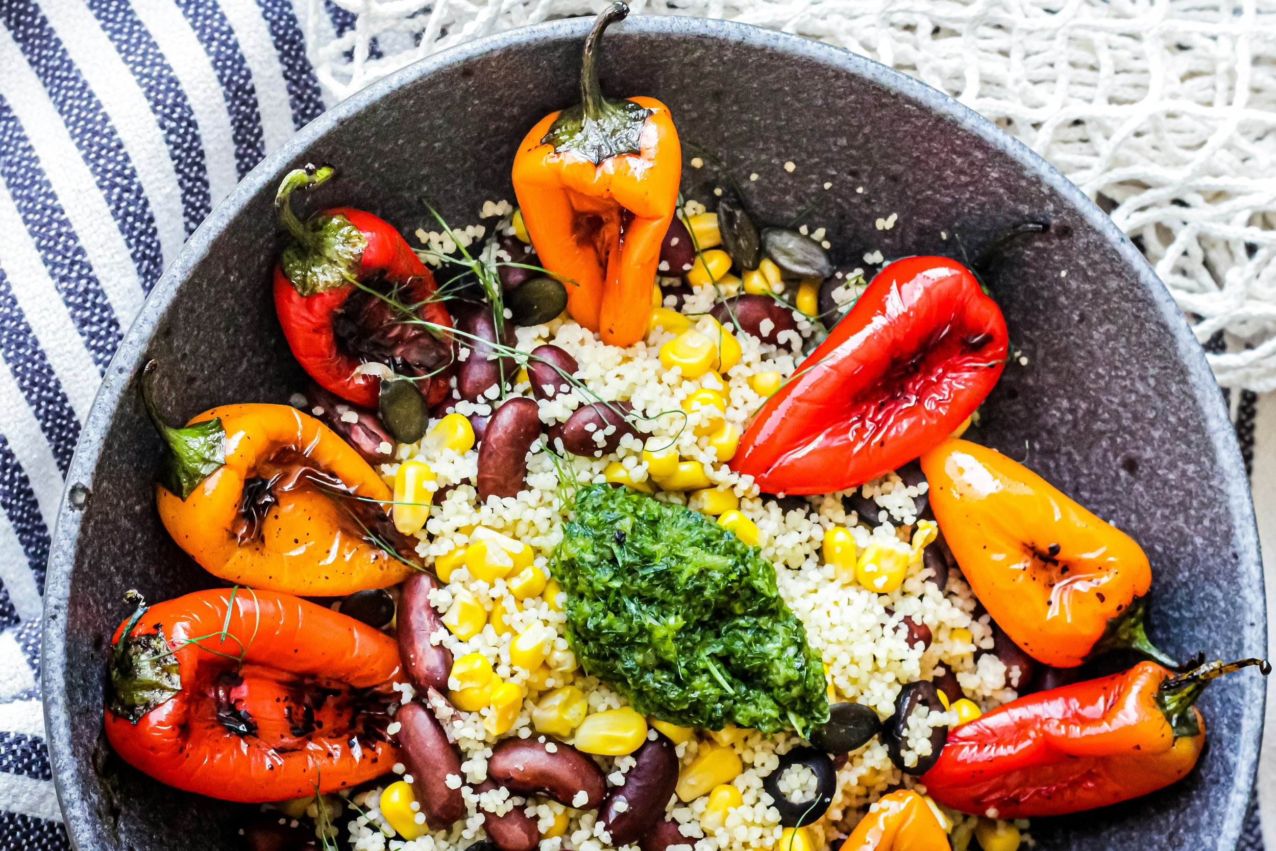
Yolélé—celebrated for its fonio, a deeply rooted ancient grain rich in West African heritage—partnered with us to redesign packaging that educates, engages, and respects cultural vibrancy. The goal? To clarify what fonio is and how it fits into customers’ daily routines, while maintaining the brand’s lively, artistic identity.
The Challenge
The original packaging dazzled with bold patterns and energetic visuals, but lacked clarity—leaving customers unsure of what fonio was or how to use it. Our challenge was to balance eye-catching cultural aesthetics with a clear visual hierarchy that improves readability and product comprehension.
Our Approach
We preserved Yolélé’s signature bold, rhythmic patterns and vibrant tones—an homage to West African artistry—while refining them for modern appeal. We implemented a unified design system across the product line, introducing distinctive color codes to differentiate product variations without compromising brand cohesion. Every graphic, font, and hue was chosen to inform, guide, and celebrate.
Impact
Created packaging that feels both culturally rich and highly functional.
Enhanced consumer understanding through clearer visual cues and organization.
Reinforced Yolélé’s identity while making fonio more approachable and engaging.
Yolélé—meaning…
“Let the good times roll!”

Before the refresh, Yolele’s packaging was vibrant and culturally rich but lacked shelf clarity.

In the initial stages of exploration, we considered a range of options, varying from those closely aligned with the original packaging to those further removed.

Logo Refinement:
Simplifying with Purpose
In refining the brand’s logo, our focus was on simplifying its form to enhance clarity and versatility across modern applications. By carefully distilling the design, we retained the core elements that define its identity, creating a streamlined, timeless mark that stays true to the original.

Final Package Designs


