CorVel
Refreshing a Brand for Healthcare Innovation
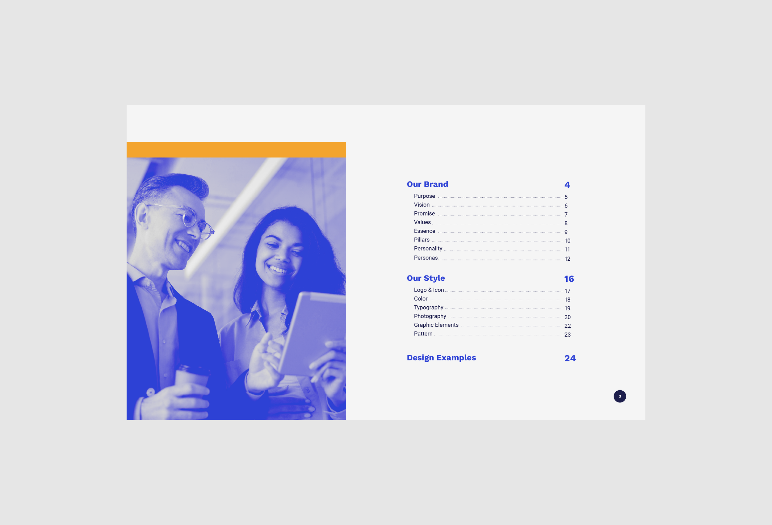
Overview
CorVel—a forward-thinking leader in healthcare management—partnered with us to refresh its visual identity. Our aim was to modernize the brand while preserving core elements that made it recognizable, emphasizing clarity, innovation, and trust across all touchpoints.
The Challenge
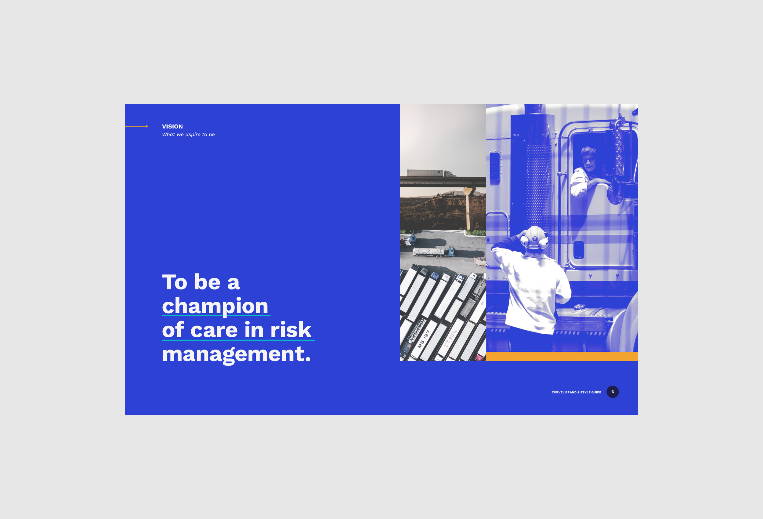
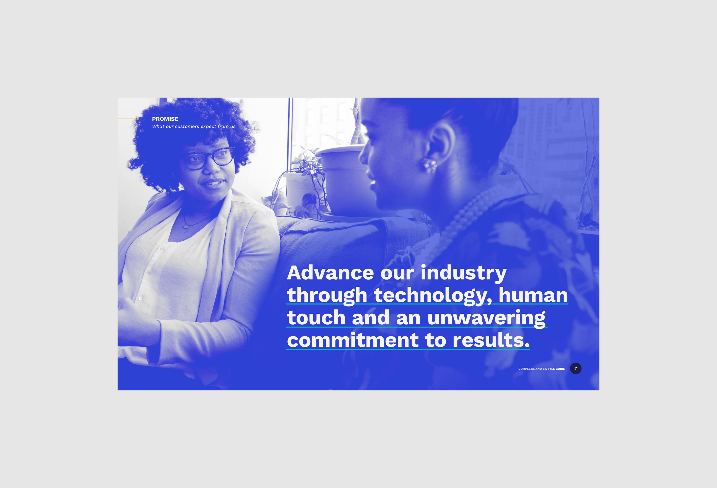
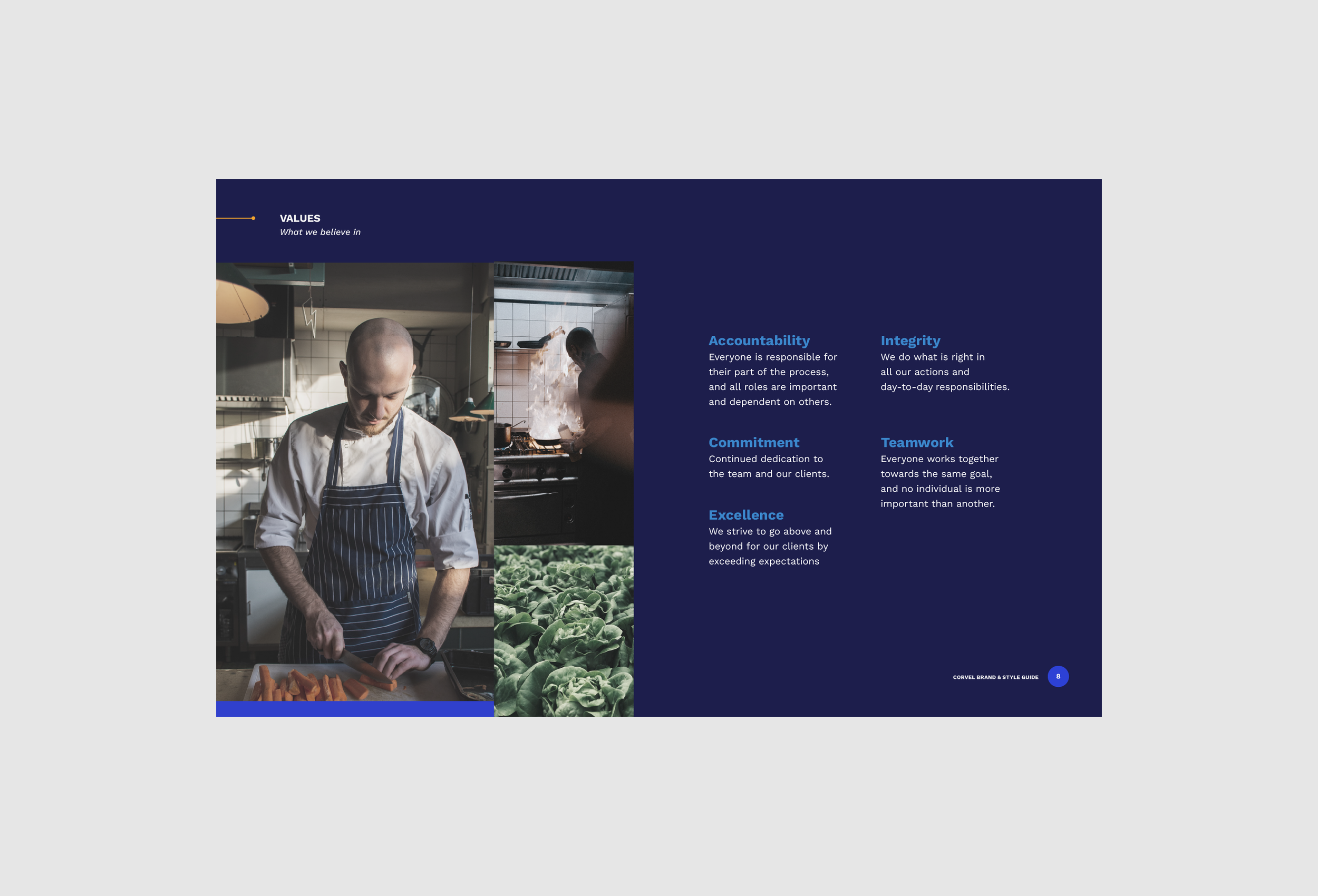
CorVel needed a contemporary, approachable design that would resonate with both their professional and broader audiences. The task was to elevate their visual presence while staying true to their heritage, striking a balance between bold innovation and dependable professionalism.
Our Approach
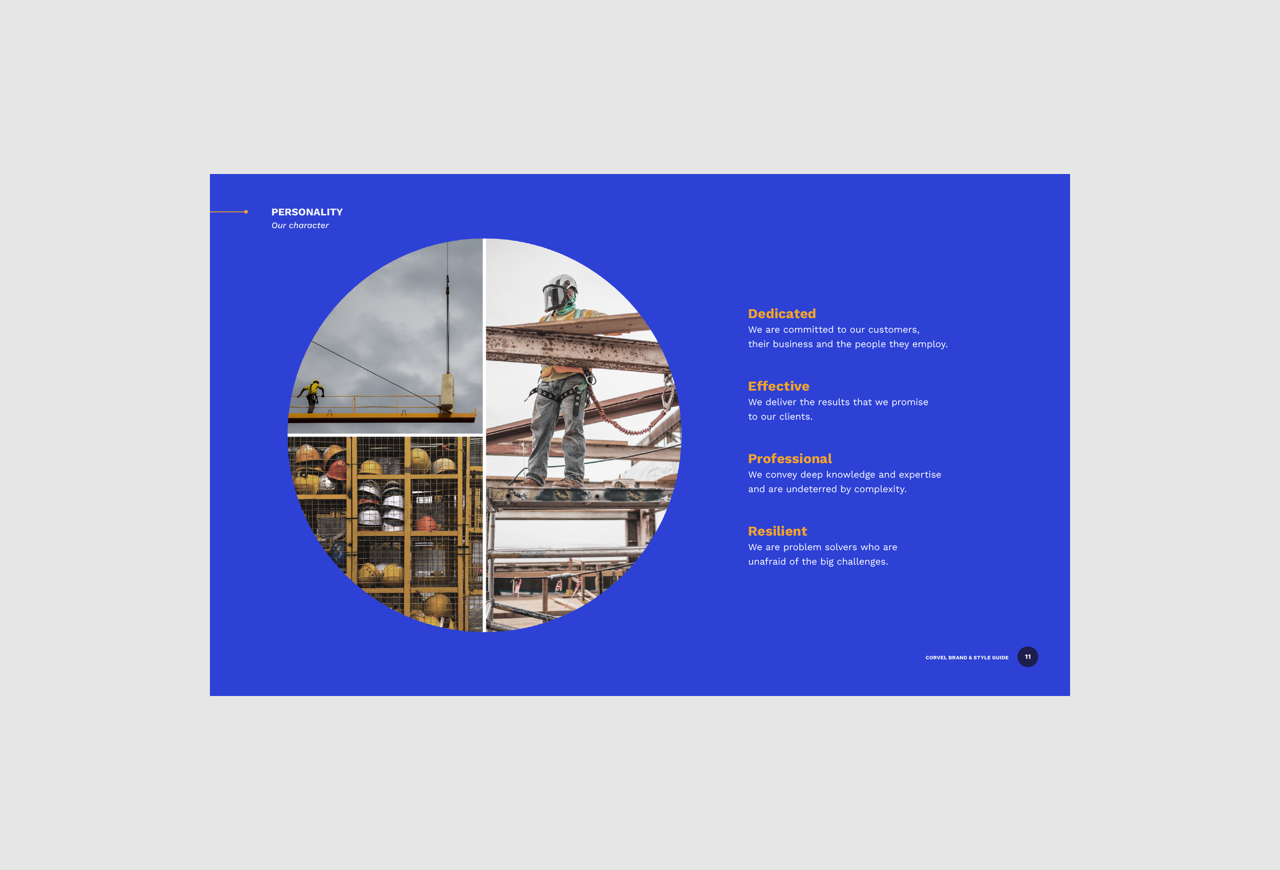
To reflect CorVel’s progressive ethos, we implemented a dynamic identity refresh:
Updated Color Palette & Contemporary Tones: Introduced vibrant hues that align with the brand’s innovative spirit.
Custom Iconography & Cohesive Image Style: Designed visuals that unify their digital and physical presence with clarity and relevance.
Modern, Clean Typography: Selected fonts that reinforce professionalism and approachability.
Impact & Ongoing Partnership
The new identity successfully modernized CorVel’s brand, positioning it as both trustworthy and progressive. Following the launch, our collaboration continued on a monthly retainer, supporting CorVel with:
Conference materials
Special event branding
A full website redesign to ensure the refreshed identity remains seamless and user-friendly across platforms